
Angular Material 3 Theming: Design Tokens and System Variables
If you work with Angular and don’t want to or can’t develop every single component yourself, you use a framework like Angular Material. One of the great things about the framework is that it is based on a modern design system, Google’s Material version 3, and supports design tokens. This provides every product/project team with a common foundation that Product Owners, designers, customers, and developers can work on together.
In this article, I describe how to implement a Material 3 theme using the Angular Material framework.
Demo Application & Source Code
What are Design Tokens?
Design tokens are essentially the building blocks of your design system. They store design-related values such as colors, typography, spacing and more. Think of them as the single source of truth for your app’s design decisions. Using design tokens ensures consistency across your application and makes it easier to update your design system as your app evolves.
Read more about Material 3 design tokens
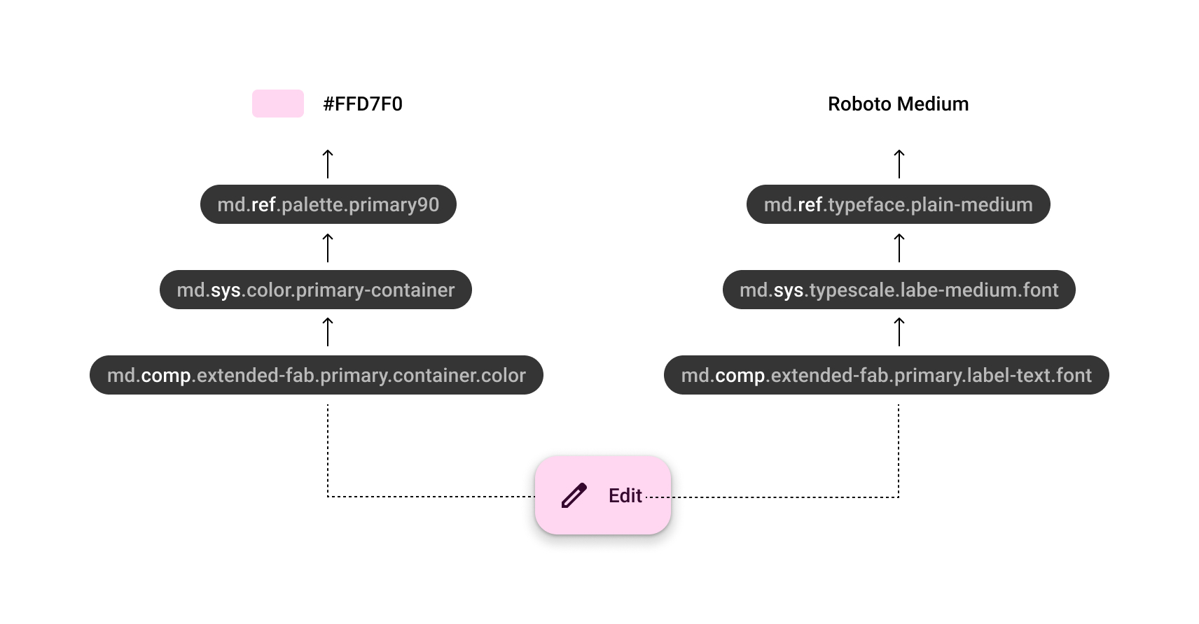
Hierarchy
Let’s look at the hierarchy of design tokens, for example, and we see that there are four levels. The component tokens reference the system tokens.
By keeping the values in the reference tokens and abstracting them through the system tokens, we can implement a new theme (dark, light, high contrast) by simply assigning new reference tokens to the system tokens.
Therefore, the component tokens should not hold hardcoded values or have any knowledge of theming. Ideally, theming should be resolved at the system level.
CSS Variables
On the web, we implement design tokens using CSS variables.
From the system token:
md.sys.color.primary-container --> md.ref.palette.primary90 --> #FFD7F0we get the CSS variables:
:root {
  // reference token
  --md-ref-palette-primary90: #FFD7F0;
  // system token
  --md-sys-color-primary-container: var(--md-ref-palette-primary90);
}
Transformation
Typically, design tokens are maintained in design tools like Figma or Penpot. From there, they are exported to JSON files in formats such as the Design Token Community Group format. These JSON files are then transformed into the respective platform, such as the web, using tools like Style Dictionary or Cobalt UI.
In this article, we assume that we already have the transformed (S)CSS files containing our reference and system tokens.
Design Tokens Lib
When working with multiple teams on a design system, you can provide a corresponding design tokens library for each
platform.
For example, an npm package like @my-company/design-tokens-web can be created.
This library would deliver the (S)CSS files containing the tokens.
Setting Up Angular Material
First things first, let’s get Angular Material set up in your project. If you haven’t already added it to your Angular app, here’s how you do it:
- Install Angular Material (in a mono repo):
Use @next to get at least version 18.1.0-next.2.
npx ng add @angular/material@next --project=demo- Custom theme:
During the setup, you’ll be prompted to choose a pre-built theme OR custom theme. For this example, select the "
Custom" theme. The schematics generate styles where
mat.core,mat.define-theme, andmat.all-components-themesare called. We won’t need this in this form because we’re doing something custom.
Custom Theme
Component Tokens
The output of the Angular Material 3 theme with a predefined color palette looks like this:
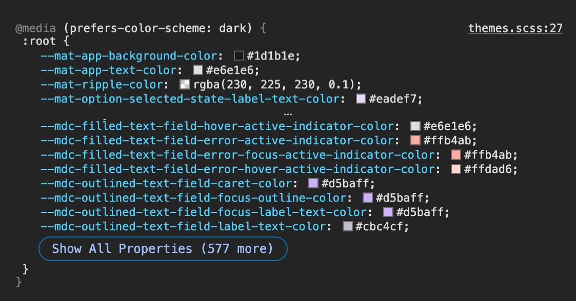
You can see many component tokens defined on the root element. The following points are noticeable:
- The component tokens start with different prefixes. We have
--mat-and--mdc-. - The component tokens only have hardcoded values.
- There are many tokens (>800), to be precise: 476
mattokens and 372mdctokens.
SCSS Theming API vs System Tokens
Previously, the Angular Material Sass Theming API was used to style
components in one place. However, considering the situation where our design decisions come as a collection of CSS
variables via a library, such as @labs/design-tokens-web, using system tokens seems to be the better choice.
Create Dark & Light Themes with System Variables
We can create a theme using the define-theme (#6) function. In line #24, the global style for all components with the
default theme is generated. In lines #29-30, the CSS variables (design tokens) for the dark theme are activated on the
root element. The new flag use-system-variables: true enables the theming API to use system tokens instead of
hardcoded values.
// projects/demo/src/styles/themes.scss
@use '@angular/material' as mat;
@function create-theme($type: light, $density: 0) {
@return mat.define-theme((
color: (
theme-type: $type,
use-system-variables: true,
),
typography: (
use-system-variables: true,
),
density: (
scale: $density
),
));
}
$light-theme: create-theme($type: light);
$dark-theme: create-theme($type: dark);
:root {
@include mat.all-component-themes($light-theme);
}
:root {
@media (prefers-color-scheme: dark) {
@include mat.all-component-colors($dark-theme);
@include mat.all-component-typographies($dark-theme);
}
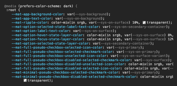
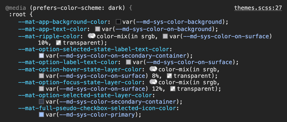
}You can see the result in the next screenshot. Now, the component tokens reference the system tokens instead of holding hardcoded values. There are system tokens for both colors and typography. Counting the system tokens, we see that 141 system tokens are used.
Wow, that’s cool, because now we don’t have to theme with 800 component tokens but only need to define 141 system tokens.
Now we just need to provide the CSS system variables, and our themes will be complete.
Provide System Tokens
With the new use-system-variables option, we can enable the use of system tokens.
However, if we look at the token structure in the Material 3 | Design System Specification,
we see that colors use the md-sys-color prefix and typography uses the md-sys-typescale prefix.
Angular Material up to version 18.1.* only provides sys as a prefix.
My token library would only provide system tokens with the following prefixes:
| Category | Prefix |
|---|---|
| Color | --md-sys-color |
| Typography | --md-sys-typescale |
My Merged Pull Request #29139 - System Variables Prefix Option
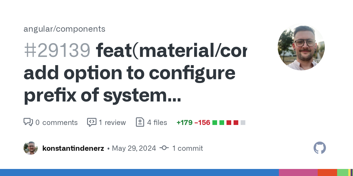
I provided the pull request #29139 for Angular Material so that we can use the Material 3 naming conventions at the system token level. ✨
This has been merged 🎉 and should be included in the minor release 18.1.*.
Using System Variables Prefix
In the following code, you can see that I define the different prefixes in lines #10 and #14:
// projects/demo/src/styles/themes.scss

@use '@angular/material' as mat;

@function create-theme($type: light, $density: 0) {
  @return mat.define-theme((
          color: (
                  theme-type: $type,
                  use-system-variables: true,
                  system-variables-prefix: md-sys-color,
          ),
          typography: (
                  use-system-variables: true,
                  system-variables-prefix: md-sys-typescale,
          ),
          density: (
                  scale: $density
          ),
  ));
}

$light-theme: create-theme($type: light);
$dark-theme: create-theme($type: dark);

:root {
  @include mat.all-component-themes($light-theme);
}

:root {
  @media (prefers-color-scheme: dark) {
    @include mat.all-component-colors($dark-theme);
    @include mat.all-component-typographies($dark-theme);
  }
}
The result looks like this 😍:
How the definition of the system tokens looks will be covered in the next section.
Token Library
As described at the beginning, the tokens ideally come through a library.
In my repository, I have created a library under projects/design-tokens-web to demonstrate providing reference and system tokens.
It is better to publish the library, for example, under the name @labs/design-tokens-web.
This can be installed with a specific version in the monorepo and would be located as version 1.0.0 under node_modules/@labs/design-tokens-web.
In my demo app, I would simply include an Sass import like this:
@use '@labs/design-tokens-web/theme';The theme.scss file is an exported SCSS file from the token library that provides all reference and system tokens at the root level.
Here is an example:
// projects/design-tokens-web/src/theme.scss

@use 'tokens/ref-typeface';
@use 'tokens/ref-colors';
@use 'tokens/sys-typescale';
@use 'tokens/sys-color-dark';
@use 'tokens/sys-color-light';

:root {
  background: var(--md-sys-color-surface);
  color: var(--md-sys-color-on-surface);
  font: var(--md-sys-typescale-body-large);
}
The reference tokens for the colors are provided with hardcoded values directly on the root element:
// projects/design-tokens-web/src/tokens/ref-colors.scss
:root {
  --md-ref-primary-primary0: #000000;
  --md-ref-primary-primary10: #001b3c;
  --md-ref-primary-primary20: #003061;
  --md-ref-primary-primary30: #004689;
  --md-ref-primary-primary40: #245fa6;
  --md-ref-primary-primary50: #4378c1;
  // ...
}
The mapping of the system tokens to the corresponding reference tokens is handled either through a media query or via the .labs-theme-dark CSS class.
// projects/design-tokens-web/src/tokens/sys-color-dark.scss

@mixin dark {
  --md-sys-color-primary: var(--md-ref-primary-primary80);
  --md-sys-color-on-primary: var(--md-ref-primary-primary20);
  --md-sys-color-primary-container: var(--md-ref-primary-primary30);
  --md-sys-color-on-primary-container: var(--md-ref-primary-primary90);
  --md-sys-color-primary-fixed: var(--md-ref-primary-primary90);
  --md-sys-color-on-primary-fixed: var(--md-ref-primary-primary10);
  --md-sys-color-primary-fixed-dim: var(--md-ref-primary-primary80);
  --md-sys-color-on-primary-fixed-variant: var(--md-ref-primary-primary30);
  --md-sys-color-secondary: var(--md-ref-secondary-secondary80);
  --md-sys-color-on-secondary: var(--md-ref-secondary-secondary20);
  --md-sys-color-secondary-container: var(--md-ref-secondary-secondary30);
  --md-sys-color-on-secondary-container: var(--md-ref-secondary-secondary90);
  --md-sys-color-secondary-fixed: var(--md-ref-secondary-secondary90);
  --md-sys-color-on-secondary-fixed: var(--md-ref-secondary-secondary10);
  --md-sys-color-secondary-fixed-dim: var(--md-ref-secondary-secondary80);
  --md-sys-color-on-secondary-fixed-variant: var(--md-ref-secondary-secondary30);
  --md-sys-color-tertiary: var(--md-ref-tertiary-tertiary80);
  --md-sys-color-on-tertiary: var(--md-ref-tertiary-tertiary20);
  --md-sys-color-tertiary-container: var(--md-ref-tertiary-tertiary30);
  --md-sys-color-on-tertiary-container: var(--md-ref-tertiary-tertiary90);
  --md-sys-color-tertiary-fixed: var(--md-ref-tertiary-tertiary90);
  --md-sys-color-on-tertiary-fixed: var(--md-ref-tertiary-tertiary10);
  --md-sys-color-tertiary-fixed-dim: var(--md-ref-tertiary-tertiary80);
  --md-sys-color-on-tertiary-fixed-variant: var(--md-ref-tertiary-tertiary30);
  --md-sys-color-error: var(--md-ref-error-error80);
  --md-sys-color-on-error: var(--md-ref-error-error20);
  --md-sys-color-error-container: var(--md-ref-error-error30);
  --md-sys-color-on-error-container: var(--md-ref-error-error90);
  --md-sys-color-outline: var(--md-ref-neutral-variant-neutral-variant60);
  --md-sys-color-surface: var(--md-ref-neutral-neutral6);
  --md-sys-color-on-surface: var(--md-ref-neutral-neutral80);
  --md-sys-color-surface-variant: var(--md-ref-neutral-variant-neutral-variant30);
  --md-sys-color-on-surface-variant: var(--md-ref-neutral-variant-neutral-variant80);
  --md-sys-color-inverse-surface: var(--md-ref-neutral-neutral90);
  --md-sys-color-inverse-on-surface: var(--md-ref-neutral-neutral10);
  --md-sys-color-inverse-primary: var(--md-ref-primary-primary40);
  --md-sys-color-shadow: var(--md-ref-neutral-neutral0);
  --md-sys-color-surface-tint: var(--md-ref-primary-primary80);
  --md-sys-color-outline-variant: var(--md-ref-neutral-variant-neutral-variant30);
  --md-sys-color-scrim: var(--md-ref-neutral-neutral0);
  --md-sys-color-surface-container-highest: var(--md-ref-neutral-neutral22);
  --md-sys-color-surface-container-high: var(--md-ref-neutral-neutral17);
  --md-sys-color-surface-container: var(--md-ref-neutral-neutral12);
  --md-sys-color-surface-container-low: var(--md-ref-neutral-neutral10);
  --md-sys-color-surface-container-lowest: var(--md-ref-neutral-neutral4);
  --md-sys-color-surface-bright: var(--md-ref-neutral-neutral24);
  --md-sys-color-surface-dim: var(--md-ref-neutral-neutral6);
  --md-sys-color-background: var(--md-sys-color-surface);
  --md-sys-color-on-background: var(--md-sys-color-on-surface);
}

.labs-theme-dark {
  @include dark;
}

@media (prefers-color-scheme: dark) {
  :root {
    @include dark;
  }
}
And the same applies to the system tokens for typography:
// projects/design-tokens-web/src/tokens/sys-typescale.scss

:root {
  // typography: https://m3.material.io/styles/typography/type-scale-tokens
  // display
  --md-sys-typescale-display-large-font: var(--md-ref-typeface-brand);
  --md-sys-typescale-display-large-line-height: 4rem;
  --md-sys-typescale-display-large-size: 3.5625rem;
  --md-sys-typescale-display-large-tracking: 0.015625rem;
  --md-sys-typescale-display-large-weight: var(--md-ref-typeface-weight-regular);
  --md-sys-typescale-display-large: var(--md-sys-typescale-display-large-weight) var(--md-sys-typescale-display-large-size) / var(--md-sys-typescale-display-large-line-height) var(--md-sys-typescale-display-large-font);
//  ...
}
Override Component Tokens
Currently, not all values (design decisions) such as states, elevation, shape, and others are represented by system tokens. You can use component tokens like --mdc-extended-fab-container-shape to adapt the framework to your own design system or you can submit a PR@Angular Material or a PR@Material Components.
In my example application, I have a FAB button that should have a tertiary style. I define this by mapping component tokens to the respective system tokens:
// projects/design-tokens-web/src/tokens/comp-fab.scss

[mat-fab][tertiary]{
  --mat-fab-foreground-color: var(--md-sys-color-on-tertiary-container);
  --mdc-fab-container-color: var(--md-sys-color-tertiary-container);
}
I would store such styles in a dedicated Material token library, for example, @labs/design-tokens-angular-material.
Conclusion
With Material 3 support in Angular Material, we have made a significant step forward. Extending to system tokens simplifies the mapping of component tokens to exported and transformed design tokens from custom design token libraries. My pull request in Angular Material goes a step further in harmonizing system tokens by offering support for Material 3 naming conventions.
If you want to learn more about Angular, Material or Design Systems, follow me on my channels like X@kdenerz, LinkedIn, Mastodon, Bluesky, YouTube, GitHub, CodePen and take my business card ✨ with:
npx konstantindenerz@latest